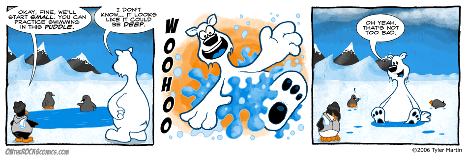
If you’ll remember, some of these puddles in Antarctica are much deeper than they appear. Some open up into gigantic underwater caverns.
Yes the comic looks a bit different today. I’m just having fun. I finished up a big project and have time to have some fun. I felt like getting away from the vector software I normally create it in.
In the News
Antarctica could have melted off the map for all I know. This weekend my mail file got corrupted and I lost all my news feeds. I did get this one before it happened, about a space rock 5 km wide that left a crater off the coast of Antarctica 100 km wide, if you’re interested in that sort of thing. Would have made a heck of a wave.
Also watched The Day After Tomorrow last night. I forgot how it started off in Antarctica. Boy, that’s a fun movie to watch with all this recent serious talk of global warming. Plus it’s been snowing here, warm all winter and now it’s snowing. 😯
MySpace & LiveJournal
I’m in your extended network! Add me to MySpace if you like. Also I will be posting any other projects I have going at my new LiveJournal.
23 Comments
Leave a response


Wally looks downright Hobbesian in the last panel.
That is, he looks like Hobbes the Tiger, not Thomas Hobbes.
Then again, I’ve not seen Tom in a long time.
He never writes anymore.
I love Osbournes “I can’t take him anywhere” look in the last panel. Wally may have found himself a new game.
I really like this different style. It’s more.. fuzzy, rugged. Not as ‘plastic’ smooth as the regular style.
I thought the style looked a bit different. Almost like a different artist altogether. Not that I’m saying a different artist would necessarily be a good thing unless it was Tyler *being* a different… I’ll shut up now.
PS Cute splash panel. Splash panel, geddit?
like the water in the second panel!!! and the baby pengiuns!!
I like the style very much, espesially background. Lovely.
Tyler,
While I like your vector work, the hand-drawn stuff just “feels” better! I’ve found on my own strip, after some rough starts, I am enjoying the hand-drawn stuff a lot more. And it’s looking better each strip as I get more comfortable. Give it a go, man! ps – I found it’s even FASTER than vector, too. I tend to nitpick and change vector constantly, because I can….
I think Iiked the other style better, but nuntheles, awsome second frame!
I definitely prefer this style!
I love this comic, I also love how you get so many small details right, like having different species of penguins and seals, and the educational blogs under each strip.
I like it better this way, must be a b***h to make though 😉
This Is Style makes the comic look it waz done by an old school hardcore comic strip drawer person(still dunno what to call u guys cuz a cartoonist is sum1 who does draws cartoons) back to the point cool style, wud’nt hurt if thi style made a reappearence every week. cuz if it appeared everyday it might get kinda boring.
I like the style Ty….course who wouldn’t! But when I picture this in your book (hopefully coming out end of this summer?) I think it will be wierd to just go from the last strip to this.
It is a great style for the short stories you plan to do because its more “Classic Wally & Oz” But picturing this style for say the strip of Max getting his flipper bit by the orca seems odd or the water balloon scenes. I think you hit it dead on wwith your original concept for the comic. Everyone loves this watercolour storybook look even me so don’t get me wrong I just don’t see it translating daily into the humor you bring to theese character. I cant picture this above Wally throwing a baby penguin can you? Glad to have you back though and scince your feeling so creative how about that Wallpaper you promised that would be really cool in the above style!
By above I mean this comic : )
yeah, it was like warm here all winter, and now its like in the 30’s, I sometimes wonder about the weather, its all messed up. Anyways, have a great day! 😀
Middle panel would make a great Avatar…
Like the new look also.
I have to agree with YoSis, Tyler……save the waterclor looks for short stories. As with any comic, first it’s the humor that carry’s the weight , second a little detail to anchor the reader.to the time and place….you’ve done that right along with your classic style….simple lines but driving the point home. But either way you decide, I’ll still be a fan, okay?
While i like the style, i think the old one fits better for the comic.
A good idea would be to use this style for flashbacks.
Ive enjoyed the comic for a long time now and one thing i really like about it is the vector-drawn style. i like the fact that the art doesnt change too much… so many comics do change and drawing styles change over time. Not that there is anything wrong with that! so many of my fave comics have evolved. But its comforting to see my buddies Wally and Osborne looking like they did the day before. keep up the SUPER work Tyler! =)
the other style is better.
Thanks for the feedback everyone. I’ll comment on it in tommorrow’s post. Some 24 hour stomach bug got me last night and I’ve been pretty out of it all day.
I think that wally is sooooooooooooooooooooo sooooooooooo hot and cute when he’s wet
hope you get better soon, Tyler!
I think the center panel of the splash, would make a great wallpaper or print on a shirt or something. I would be buy it on a t-shirt.
Great comic!